The Final Product
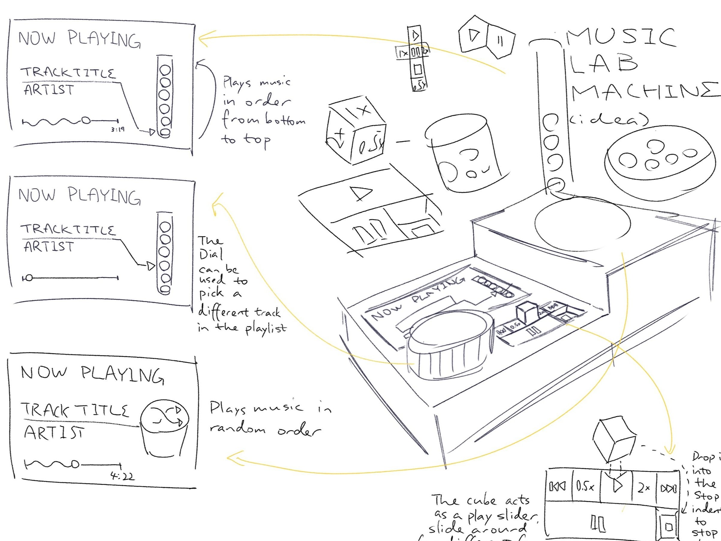
Music Lab’s final design featured four key tangible elements: The mixtube, music bin, play/pause scrubber, and control dial. These four were placed in an arrangement that surrounds the primary display interface, making sure that no physical interactions would obstruct the view.
The Design Challenge
The task for this project is to design a music playback device that affords tangible interactions to the person engaging with it, affording elements of physicality to allow for manipulation in three-dimensional space.

Our team kicked off our ideation stage with a design activity, breaking down the interactions of former music devices to identify the concept model of how the experience was designed and defined.

We used the first-generation iPod as a reference, studying one of the most iconic physical music devices that popularized contemporary apps such as Apple Music and Spotify.
We recognized that the iPod’s user experience flow involved two core mediums – the computer and the iPod device – the former serving as the source of media provision while the latter as a passive playback device. The control mechanics are centralized onto six primary affordances: quad-directional buttons, a touch-activated click wheel and a middle button.
The simplicity of this model allowed users to focus their interactions on the operating system, which is optimized for these common physical actions so that users can easily navigate its complex structure and do more within a single device.
Concept Ideation
💡


Various models of our concept sketches were developed during team discussions. Our ideas centered on core functionalities of the music player, thereby identifying physical affordances to fulfill them.
The next step in our process was shifting focus onto concept development, where we started identifying the critical and sub-functions our device could afford. For each item, we came up with ideas that may fulfill the interaction.
💡Our inspiration to call our project Music Lab was inspired by the concept of scientific experimentation. The tokens we opted for the project revolved around selecting music (to dispense), operating the machine, and mixing in a “mixtube” playlist.
🎱 Steel Ball Bearings
Each metal ball bearing represented one specific musical soundtrack.
🧪 Test-Tube
The ready-made test tube served as the shell of a musical playlist, allowing the ball bearings to fill the space in a stack.
A blue cap on the test tube represented the playlist identifier (and its creator).
🎲 6-Side Cube Die
The six-sided white cube was the control for the playback scrubber knob.
🕹 Wood Puck + Joystick
A circular wood puck represented the central control knob of the interface. Coded to its user, we imagined the ability for a coded integration to connect the user’s profile to their existing music streaming services.
The mechanism of a quadri-directional joystick helped provide tactile feedback when moving the controls in either direction.
Our team deliberated on multiple variants of similar affordances to discover the best means of interaction. For example, we once considered having a standing (vertical) stack of ball bearings versus a stack laid down (horizontal). We aligned our process to the double diamond “Discover – Define” approach to brainstorm possibilities while connecting (and re-connecting) the dots to develop a fluid experience with other affordances.
Prototyping The Build
Initial Product MVP

The outer shell of the initial music player.

The user flow of Music Lab’s software interface.

Affordances such as a play/pause scrub, music bin and mixtube rack was added later.

Each screen in the journey was later modeled as individual paper prototypes using ready-made products.
· From the combination of affordances we raised in our discussions, we spearheaded the concept with a rapid prototype MVP using cardboard and paper.
· The scale of the unit was not of core importance initially. Thus, much of the materials used consisted of ready-made products, such as test tubes, metal ball bearings, 5 x 3-inch cards and Post-Its.
· The colors of the ready-mades acted as a model of our different software interface modes.
Revised Prototype
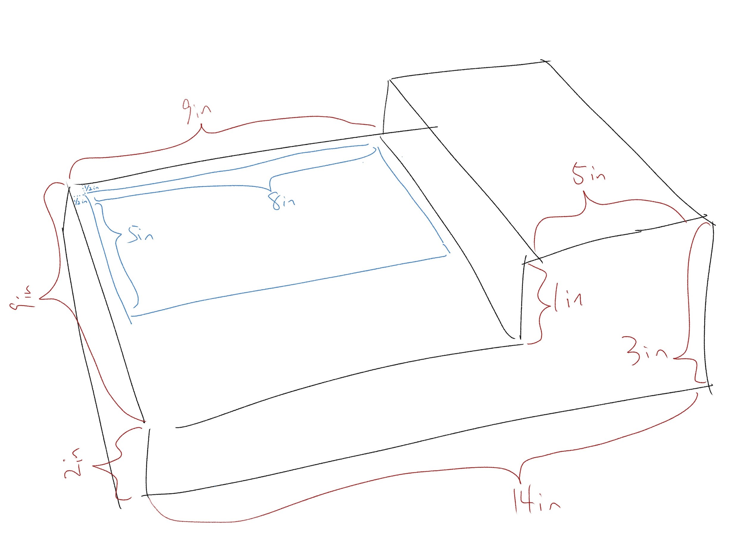
The revised build was scaled larger to accommodate a larger display area that would fit the full control dial.
The projection interface was designed on Figma with the same aspect ratio to ensure visibility.
Following feedback from our initial prototype critique, we moved forward with developing a more refined revision using prototyping tools like Figma. We intended to replace the 5x3” paper cards on our initial prototype with projected UI screens to create a simulated mockup.
While the physical build had little change to the overall concept, we recognized that the original scale was not feasible for interaction. Our team had to reconsider an appropriate scale that would accommodate the visibility of the user interface while ensuring the other components would be secured in place. We had to re-think from the ground up, starting from the display scale, then the scrubber and then the music bin.
Later Additions/Revisions
One of the issues we identified from initial prototypes and feedback was a lack of signification from unmarked signifiers of the metal ball. Without clear indicators, it would be hard to tell which token belonged to which music.
Using space at the bottom right of the outer shell, we modeled the concept of a secondary display designed to provide quick affordances independent from the main UI.

The secondary display allows the user to identify music tokens and playlists and view music playing in the background while engaging with other modes of the user interface.